Logos Through the Years

Legacy of Leadership

Our logo is more than just a symbol. It helps tell the story of who we are, what we stand for, and where we are going. For a century, Barton Malow has been a leader in the construction industry, delivering excellence and innovation to our clients and communities. Our logo and brand may have evolved, but our core values of integrity, partnership, and empowerment – officially established in 2012 – have remained the same. Explore the history and meaning behind our logos and brand throughout the decades.

Pre-1960s

The earliest Barton Malow logo is still a mystery, but this simple design was painted on many of our initial equipment, signs, and billboards, featuring the company name in a bold font. It was the first symbol of our presence and reputation in the construction industry.

Sylvestor Wolfe's Business Card

This business card dates back to 1932 before the C.O. Barton Company officially changed its name to Barton Malow Company. Sylvestor Wolfe was named Barton Malow Company’s Chief Estimator and Secretary and was a part-time team member earning $1 per hour when work was available. Learn more about him in our Heritage story.

Goebel Brewing Company was a brewing company in Detroit, Michigan from 1873 to 1964, eventually acquired by Stroh Brewery Company. In 1946, Barton Malow was contracted to build one of the brewery's facilities in order to keep up with the company's growing demand. Our logo can be seen displayed on the jobsite sign.

1960-1978

The stacked “B” and “M” logo used from 1960-1978 was inspired by our first logo. It marked Barton Malow’s 50th anniversary and was featured on various memorabilia and marketing items.

Barton Malow Ashtray

Before traditional brochures or felt-tip pens with a company logo were commonplace, many organizations capitalized on trends when creating marketing materials – a major one being customized ashtrays. Throughout the 1960s, Barton Malow constructed some of today’s most recognizable buildings across Southeast Michigan. They included production plants and headquarters for the “Big 3” domestic automakers, United States Rubber, Federal-Mogul, United States Postal Service, and the Jeffersonian, one of the 30 tallest buildings in Metro Detroit.

Each notable project can be seen on this commemorative 50th-anniversary gift presented to clients.

The Jeffersonian
Ford Motor Company
United States Post Office
Cadillac Motor Car Division
Barton Malow Commemorative Ash Tray
Barton Malow Company General Contractors


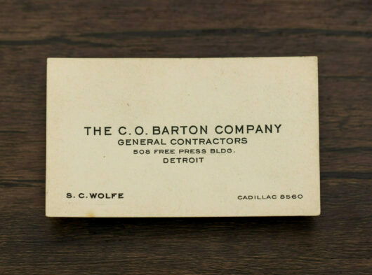
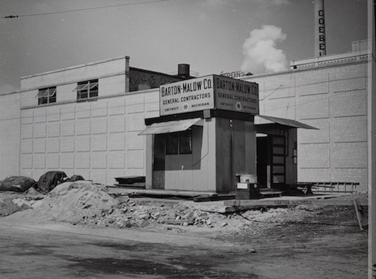
This metal sign is one of the few relics that features our first and stacked logo. It was discovered at Barton Malow's Yard in Oak Park, Michigan by our current President + CEO Ryan Maibach. He took the sign home and kept it. After many years, the sign was moved to the third floor of our Southfield headquarters, where it still hangs today.

1978-1990

This logo debuted in 1978 and its use spanned 12 years. The orange was a variation of the previous logo, while the curvy texture was a nod to our first logo.

1990-2020

Did you know that Barton Malow’s longest-lasting logo was actually a design mistake? Look hard enough and you’ll see that our blue and white logo from 1990 – 2001 contained off-centered text.

In 2001, an outside vendor put a small square on the second line of the logo, thinking it needed “something extra.” Once the square was added to the logo, the negative space revealed a stylized tower crane. This logo was used to represent the brand until 2020.

2020-Present

Our current logo and brand identity launched in 2020, after almost three decades of using the same logo. Our new logo has a simple, modern, and elegant wordmark in dark blue. The adjacent shape resembles a stylized tower crane and is inspired by the logo that preceded it.

Barton Malow’s internal Creative team created the logo in-house with ideas from previous versions and respect for the jobsite. The stylized “B” and “M” and tower crane were inspired by previous logos. The slab serifs hint at structural steel and connection points ongoing construction. The team transformed the square from the 90s logo into a dimensional shape that inspired the hexagon shape. The dimensional shape indicates the transformation and growth that Barton Malow continues to experience.

Today, just as 99 years ago, you can see our logo on anything from construction equipment to memorabilia.

Related Stories